This will be a very short post as I’m absolutely overloaded with schoolwork at the mo’. As promised, here are the comparison swatches between the Urban Decay Naked foundation in shades 6.0 and 7.0.
This is currently my favorite foundation, and you can read my original review for shade 6.0 here.
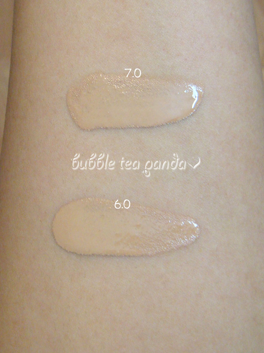
The below picture is of the foundations swatched heavily. As you can see, there is almost no perceptible difference though 7.0 is just a smidge darker. Depending on your monitor’s color balance, you may not even see a difference. These are swatches on my inner forearm, which is much lighter than the rest of the body.
Urban Decay Naked Foundation – 6.0 and 7.0 Comparison Swatches
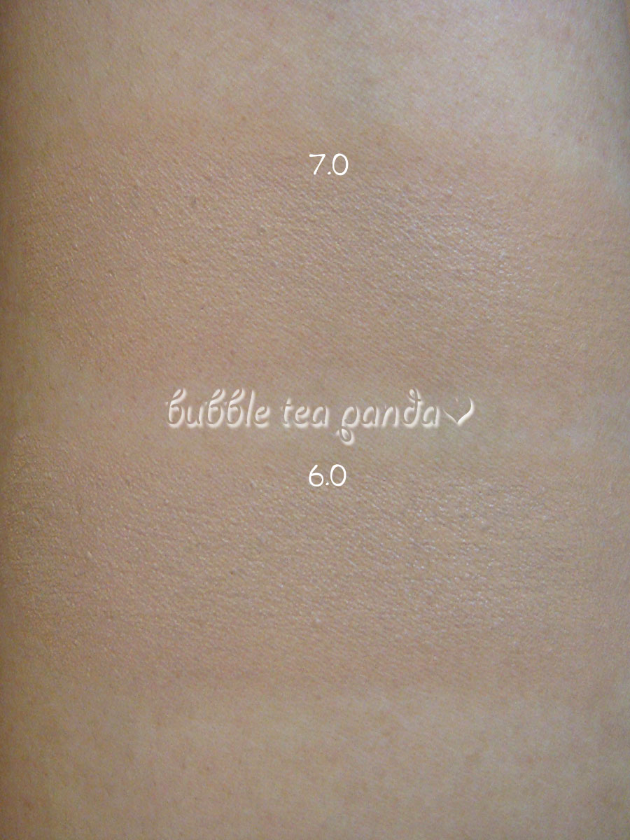
The next picture shows the foundations blended out. Here, there is a more noticeable difference although it’s still not dramatic. 7.0 is a bit more honey-/golden-toned than 6.0, which looks to lean a bit more neutral.
Urban Decay Naked Foundation – 6.0 and 7.0 Comparison Swatches
That is why I think 7.0 actually suits me better, as I have such strong golden tones in my face. Although 6.0 is not massively lighter, the neutral tones make my face look a bit grey or ashy which tends to make it look just a wee bit too light. (Similarly, this is why so many BB creams look so grey, as it gives the illusion of lighter, white skin.)
Hope this helps anyone who might be waffling between shades! I’m trying to catch up on schoolwork so hopefully I can be back to blogging 100% soon!
Disclosure: All product(s) featured in this post were purchased by me. All opinions are my own.
